Introduction
A year (give or take) has gone by since Google's release of the first Android version devoid of a sweet name, so you know what that means, right? Android 12 is here - well, "here" on Google Pixel phones and nowhere else, but still. Despite continuing with the 'boring' naming scheme, the company has packed quite a lot of new stuff into this iteration of its mobile operating system, more than we've been used to lately, so we took a deep dive and explore what's new in Android 12 - features that are live today on Pixels and of which some may eventually make it to a few or more other devices running Google's OS.
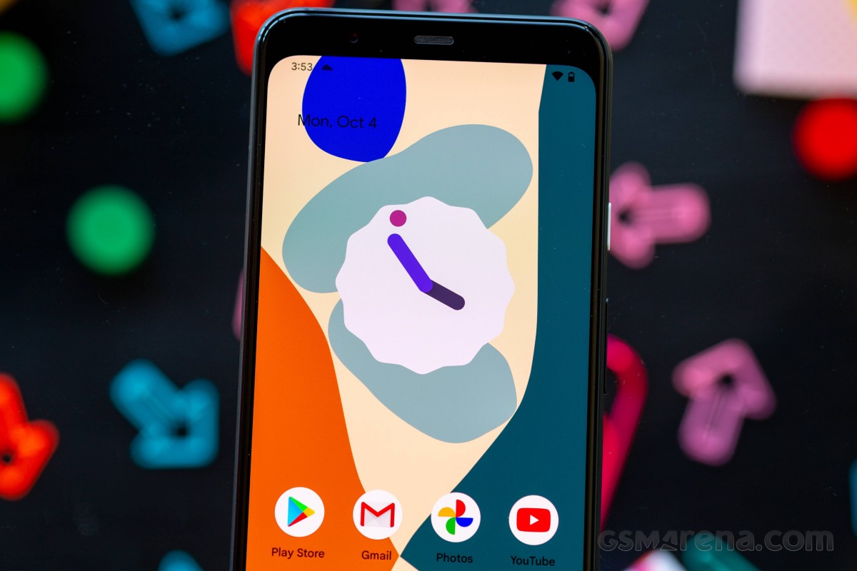
Like its predecessors, Android 12 went through months of iterative development, with a bunch of developer preview builds making way for public betas and now it's time for the 'final' release to drop. While Android 11 didn't really introduce any major groundbreaking features, Android 12 comes with the biggest redesign in years - an entirely new paradigm of approaching the user interface, through its theme engine that dynamically adjusts all UI elements based on the wallpaper you've chosen.
This is auto-customization at its finest, and we'll definitely start this review by looking at that. But that's not all - Google has packed other new things into the release as well. Animations have been redone to feel more fluid, motion on screen is smoother, there's a new Privacy Dashboard, indicators for when apps are accessing the mic or camera, the ability to share approximate location information only, support for scrolling screenshots, new conversation widgets, and of course the notification shade has been redesigned - that's a meme at this point because it happens with every new Android release. This time around, however, there's also a very big redo of the Quick Settings tiles to go along with it.
Android 12 new features at a glance:
- Automatic theming system based on your chosen wallpaper
- New Material You design language throughout the OS and Google apps
- New widget picker in the Pixel Launcher, with new widgets for Google apps
- Redesigned Quick Settings with integrated smart home controls
- Fresh new lock screen and Always-on Display look
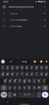
- Universal on-phone search in the app drawer
- Easy link sharing from Recents
- Extra Dim screen setting, improvements for picture-in-picture and auto-rotate
- Support for scrolling screenshots
- New Power menu, new setup wizard, and new emoji
- Improved performance and fluidity
- New Privacy Dashboard, camera and mic usage indicators
Note that all of the new features we are discussing in this review are currently available for Pixels only, and as always, it's up to the other Android device makers if they adopt all of them or a small subset (or anything in between). So while we are very curious to explore what's new in the latest version of the OS, we don't know how many of these things will ever launch on handsets that aren't made by Google. This has always been the state of Android updates, and we're putting this out in the open so you don't have unrealistic expectations.
As usual, expect Android skins that stay close to stock to eventually incorporate most of these features, while the heavy ones that stray far from what Google does are the least likely to get the user-facing stuff. That said, the under-the-hood improvements should theoretically be there for everybody once Android 12 updates start rolling out en masse.
That's it for the introduction, we invite you to join us over the next few pages as we take a look at everything that's new in Android 12.
This review has been based on Android 12 beta 5 (a.k.a. the Release Candidate), which was the most recent release at the time of publishing. Google is yet to seed the Final release to even Pixel phones so will revisit all chapters making sure their content is up to date and relevant to what's available in the Final release.
Auto themes: Material You design
Themes have long been an integral part of most Android skins out there, and yet they've all taken the same approach, which is basically "have a theme store, allow theme developers to post their stuff there and phone users to download and install their works". That's all fine and dandy if you love scrolling through endless lists of possibilities, but what if you want customization without all the work that entails? What if you want some kind of automagic "it just works" personalization of your device's looks?
That's exactly what Google is delivering with Android 12. The system uses color extraction to determine the dominant and complementary in your current wallpaper and then uses those (along with other matching colors) to magically auto-create a custom theme on the fly. This completely alters the system-wide color palette, widgets, everything across the entire OS: the notification shade, the lock screen, the volume controls, the widgets, the launcher, the Settings menu - they all change.
It's a straightforward idea, really, if you think about it, but one that undoubtedly requires a lot of processing power behind the scenes to make things feel this seamless in operation. Google has a new name for the resulting design language: Material You.
It's easy to see where that comes from. Material Design was introduced by Google to Android many years ago, and it's been through a few iterations since. With Material You, the focus is on the easy automatic customization described above. But of course, that's not all of it - Google has subtly redone fonts, boxes, menu items, and the likes to make for a more modern look. And it works. If we dare say so ourselves - Android 12 is by far the best-looking Android version yet.
Manually tweaking
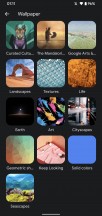
Diving a bit deeper reveals that while the point here is for everything to work automagically, you can manually alter things. In fact, there's an entire section in Settings called Wallpaper & style that lives for that sole purpose. Here you can change the wallpaper, and if you hit that button, you'll be treated to the interface of Google's Wallpapers app, which has been fully integrated into Settings. It has a bunch of categories to pick from, each with a lot of wallpapers inside, but you can also tap the icon at the top right of the screen when you're browsing a category - this will make the phone automatically switch to a new wallpaper from that list every day.
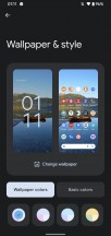
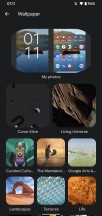
Wallpaper picker
The default for colors is "Wallpaper colors," which does what we described above, but you also have the choice to go with "Basic colors" and pick from four options. The color you choose will become the main one in the newly created theme (think OnePlus' "accent color" from back in the day). "Wallpaper colors" can have just one palette option under it, or up to four, depending on the wallpaper, by the way. The first one on the left is the automatically applied one, but if you get more options, you can also instantly switch to a new color palette from here without going into the "Basic colors" section.
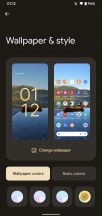
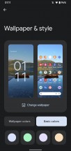
Wallpaper & style section
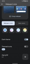
Finally, in this section, you have the Themed icons setting, which is labeled as being in beta still. This will attempt to create custom app icons on the fly based on your current theme - with varying degrees of success, we'd say. In short, the "beta" label is very much warranted in our view, but we do hope this evolves into something that works better and with more icons. Because icons/icon packs are so far something that isn't touched by Google's new automagical customization system, and it would be a very interesting thing if it did. As things are now, if you use "Themed icons," you'll get what it says on the tin, but only for a subset of your app icons. Right now, it seems that only Google apps get the treatment.
Themed icons
Those will all have the same colors, which is neat. However, it creates a bigger disparity with the icons that didn't get themed. This results in a very odd look unless you are lucky enough to only use apps with icons themed in this manner. If you find yourself with a set of themed icons, we can't overstate how great-looking the design consistency is.
Of course, there's still a "Dark theme" - this works with the auto-theming system, making backgrounds dark or light based on your choice. This setting is confusingly found in no less than three different places in Settings: Wallpaper & style, Display, and Accessibility. Whereas in Wallpapers & style, you can only toggle it on or off, in the other two spots, you have the option to schedule it too. This level of redundancy is a bit much even for Google.
Themed apps
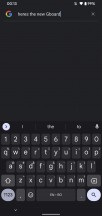
The auto-theming in Android 12 goes beyond just parts of the system like the notification shade and Settings and such. Google apps have slowly been updated to incorporate the auto themes, which are more or less subtle depending on the app. We especially like how Gboard, Google's keyboard app, automatically receives a new theme when a new wallpaper is applied, in line with the system theme.
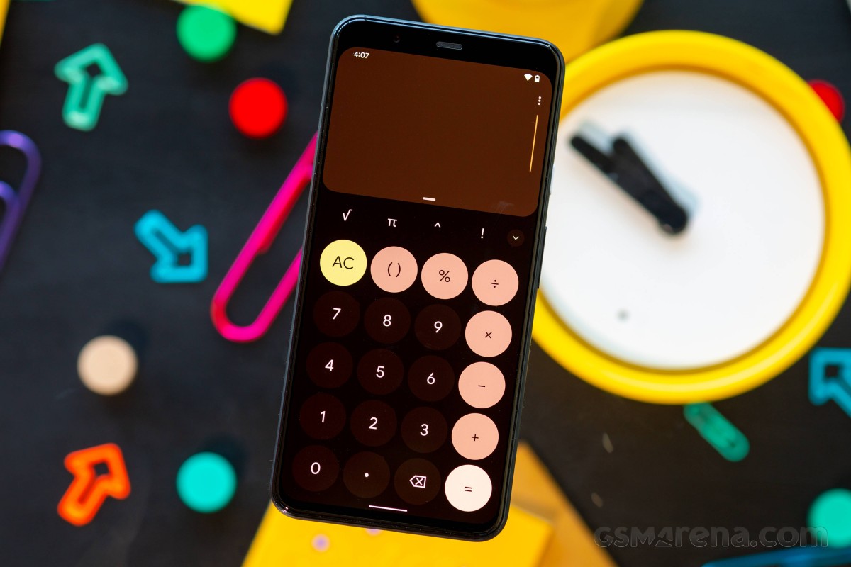
But it's far from the only one - Gmail, Keep, Calendar, Meet, Drive, Docs, Sheets, Slides, Calculator, Clock, Lens, Chrome, Contacts, Camera, Messages are all covered, and we assume it's only a matter of time before Google gets round to updating all of its apps to take advantage of the auto theming system.
Gboard automatically applies the Material You theme
This obviously makes for a very consistent look across the OS and Google Apps, and that's praiseworthy for sure, but there's an interesting side effect of this strategy, which is that third-party apps now look a bit out of place.
App developers can tie into the auto-theming to extract the color palette used and apply it to their own apps. While Google will definitely showcase how this could work in an ever-growing list of its own apps, we think it will be at least a few weeks (or months) until you'd be able to see all of your apps magically change looks every time you set a new wallpaper.
That seems to be Google's idea, though. Still, as with all things that require third-party Android developers to 'bite in', we wouldn't bet on any significant part of this vision ever coming to fruition. Especially if Android 12's Material You auto-theming never makes it to any of the skins of the big device makers.
The whole point of having a very integrated design language is lost if not everyone plays along - the more apps adhere to the system, the more the ones that don't stand out, and not in a good way. This could act as a way to twist the developers' arms into adding the functionality. Still, Google's tried this a few times before with Material Design and its successors, and to this day, it hasn't had a ton of success in convincing developers to all go with a similar design language. Maybe this time's the charm? Sure, but then again, maybe not.
When it comes to Google's own apps, though, everything looks very consistent, and it's not just about the apps grabbing the same color hues from the wallpaper as the system bits. Material You is also an evolution of the company's overall design language, now reaching new heights of maturity.
More Material You Google apps
Obviously, some apps will be changed more than others when it comes to looks. And even if you're running Google's suite on a phone that isn't a Pixel with Android 12, you'll still see subtle design improvements from the new Material You theme - just without the color matching (as portrayed in the image above).
The floating action button is no longer round, now taking on a more squircly shape, with a gentle color highlight around it. This goes for the buttons in the bottom bar too, they no longer show which section you're in by having the icon be a different color. Instead, the icon is filled and surrounded by a colored oval. Ovals are the new rectangles; in fact: in Gmail, that's the shape of the expanded Compose floating action button, as well as the shape of the search box up top.
Widgets
Widgets can also benefit from auto-theming, and again those for Google apps are on the front line. The Widgets API has been improved for Android 12, which means you can now natively interact with checkboxes and radio buttons and switches in a widget - this should make the experience more seamless.
The widget picker offers responsive previews for differently sized widgets. The new API supports dynamic coloring by tying into the Material You theming engine, allowing the widgets to adapt to the wallpaper.
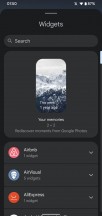
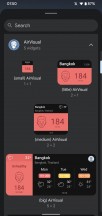
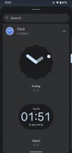
New widget picker, new widgets
Google has created and updated a bunch of widgets with the Material You looks for its various apps, and they all share the same striking new design - as well as the automatic color customization, of course. They all have rounded corners, too.
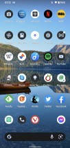
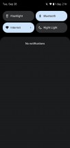
Redesigned Quick Settings and notification shade
It can't be a new Android release without Google tweaking the notification shade somehow, can it? This is such a meme at this point but obviously based on fact. Case in point: Android 12 tweaks the looks of the notification shade. Surprised? You really shouldn't be.
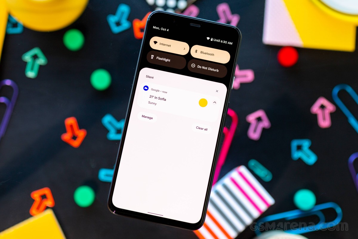
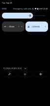
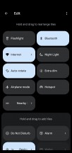
What is perhaps more surprising is that this time around, the Quick Settings tiles have been revamped too. Google Pay and Home Controls now reside here, too, having been moved from the Power menu in a rather confusing manner. After all, these were only added to the Power menu last year in Android 11 and were a big new feature then, and now they're gone from there and into the Quick Settings screen. Okay, Google, we definitely needed yet another way to access the Assistant - which is what you can do now with a long press of the Power button (though thankfully this is opt-in, so if you don't change that setting, you'll get a plain old Power menu instead).
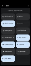
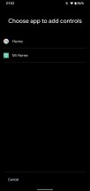
Device controls in Quick Settings
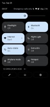
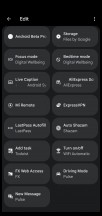
The Quick Settings tiles are now huge, and as a result, you only see four of them when first swiping down the notification shade. This may make for a nicer design, but functionally it's definitely a step back from how things used to be. Form over function, as they say. Even when fully expanding the Quick Settings screen by swiping down again, you only get to see eight tiles, which isn't a lot - consider that you already get six tiles after the first swipe in some Android skins. Anyway, it's a love it or hate it affair, this, for sure.
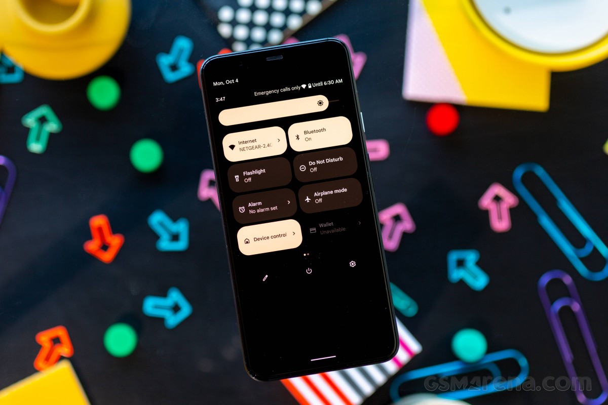
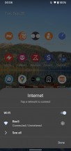
A new thing is that the Wi-Fi tile is now labeled Internet, and this one tile basically aggregates the Wi-Fi and mobile data settings into one. Because the tiles are huge now, there's room for an icon to the left of the text, which tells you what you're connected to (the Wi-Fi network's name shows up when you further expand the Quick Settings tiles). Tapping on the tile pops up an Internet menu at the bottom of your screen, where you can quickly connect to another Wi-Fi network, as well as turn mobile data and Wi-Fi on or off.
New Quick Settings tiles and notification shade
The notification shade itself has differently rounded corners now (because why not), and the notification categories are easier to notice because of the redesign. Additionally, suppose you mark a given conversation as "priority". In that case, the Pixel Launcher will pop up a question asking you if you want to add a conversation widget to your home screen for that contact. Also, apps can now show animated images in notifications, and they can let you send images when you reply from the notification shade.
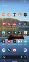
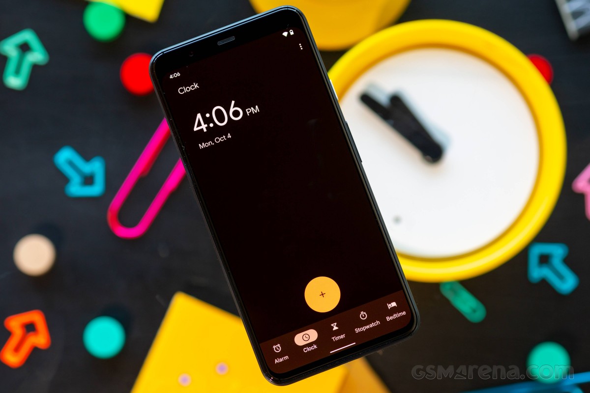
Lock screen and Always-on Display
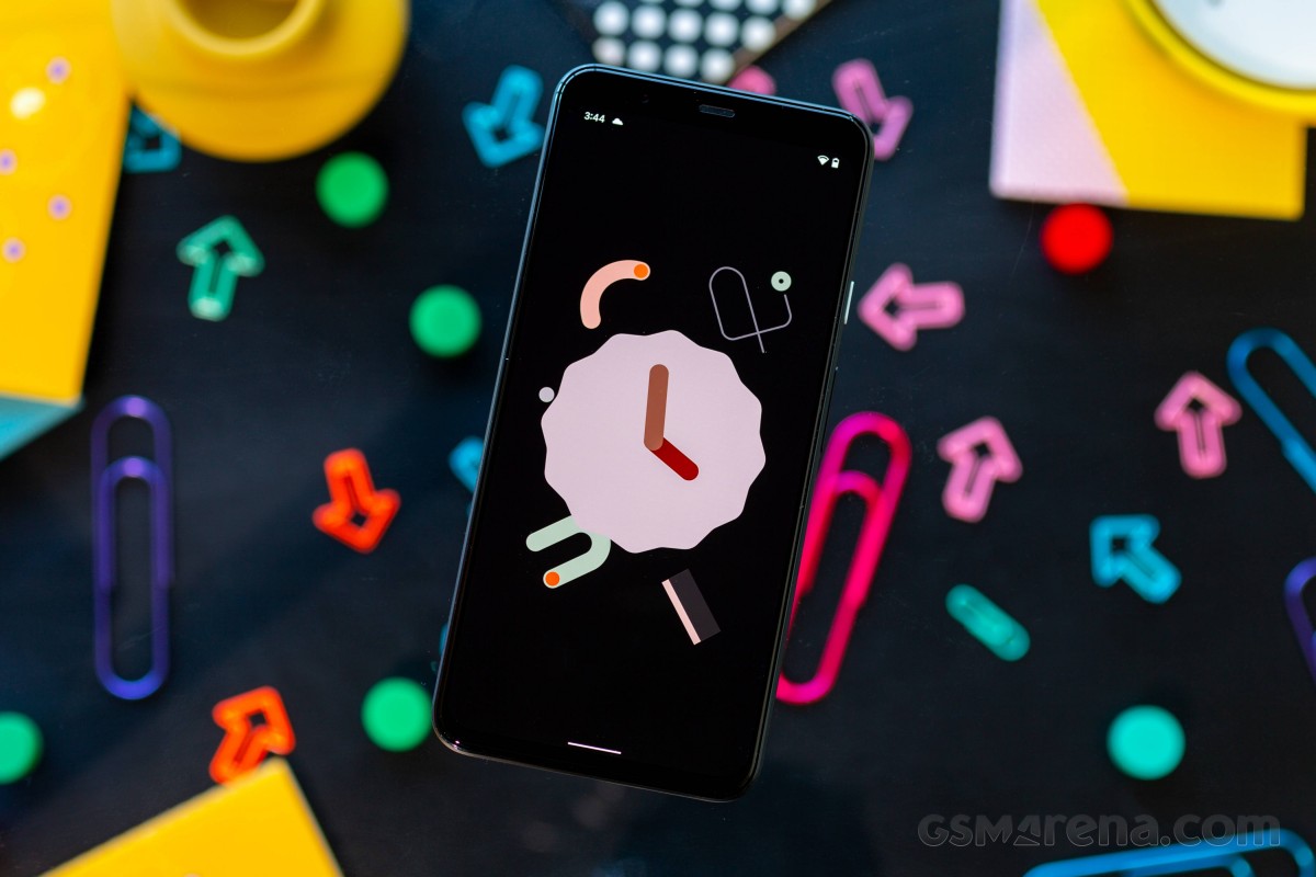
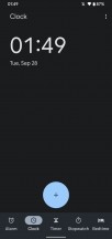
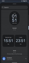
The lock screen has been altered by Google's new design philosophy too, but not necessarily in functionality per se. Instead, the main change is that you see a huge clock when you don't have any notifications, and this becomes smaller when notifications are waiting for you - it's a subtle nudge letting you know the current state of affairs.
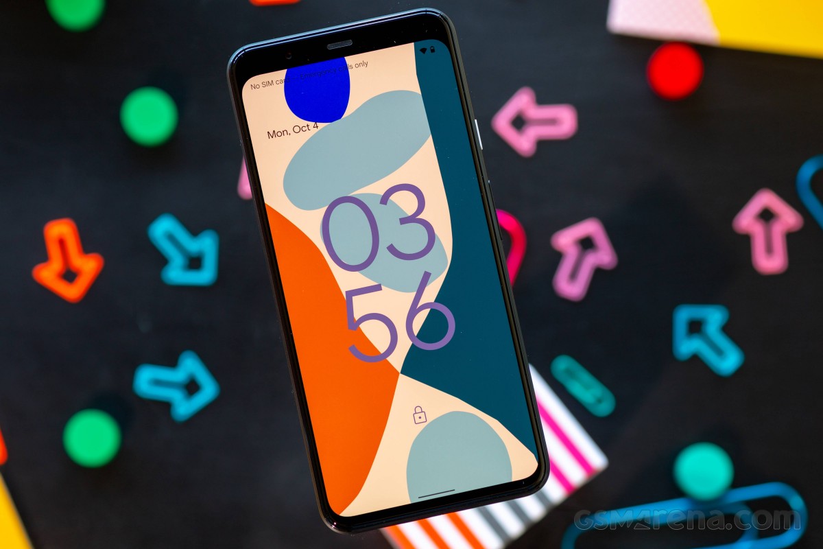
That big/small clock dichotomy expands to the always-on display as well, so you're never in doubt about whether something's waiting for you to attend to or not.
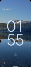
New lock screen clock shown when no notifications are present
Above the clock, you get the day of the week and date info, as well as weather conditions and temperature. At the bottom of the screen, centered, sits the battery capacity on the AOD. This disappears on the lock screen for some reason (and it's not shown as part of the status bar on the lock screen either).
Comments
Post a Comment